Writing Outwardly 
Silk
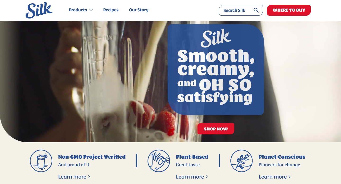
Silk's website has features, benefits, and experience. The feature is that it's a non-GMO project and verified. The benefit is that it's plant-based and has a great taste. The experience is that it's planet-conscious and claims to be pioneers for change.
Not Burying the Lead 
Rover
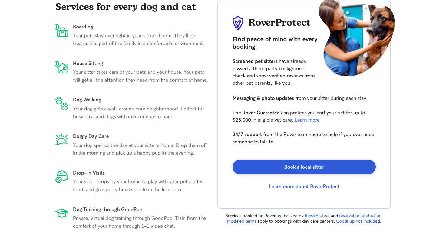
When you scroll past the initial fill-out section for Rover, you get to this part with information that is straight to the point. The first thing you see is an informational fill-out sheet about services, and the subheader is also "Book trusted sitters and dog walkers".
Not Saying Too Much 
Dior
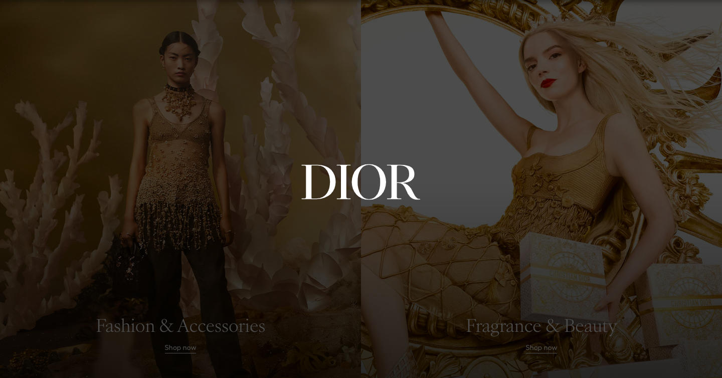
Most luxury websites don't have much information but will have big images and/or interactive content you have to scroll through to look for new releases, etc. Dior is a good example because you have to move your mouse over the two images for the video to play, and you have to scroll to find out more about this year's releases.
Making a Strong Call to Action 
Chase
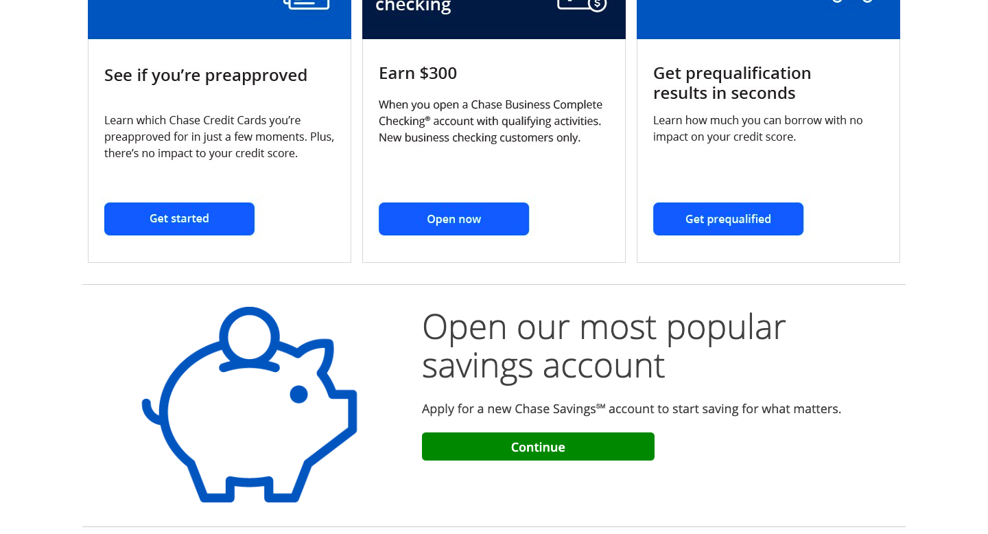
Chase's website is mostly call-to-action buttons with text such as "Open an Account", or anything related to opening an account/getting approved. It gets straight to the point and these call-to-action buttons are in different colors to make them stand out. It's clear and compelling for the user because above the call-to-action buttons are all the benefits like, "Earn $300" and then more calls to action.
